
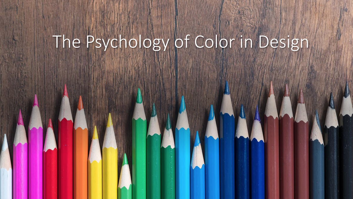
23 Jul The Psychology of Color in Design
By Divya Pathak
“Color is a power which directly influences the soul.”
-Wassily Kandinsky
Color has a great impact on our lives, mood, and our mental and spiritual well-being. Though, our reaction to any color is often very personal and is rooted in our experience and culture, there are still some color effects that have universal meaning. In this post, we will be talking about the “Psychology of Color in Design” and how it influences the user and their day-to-day life.
Red- Color of Passion
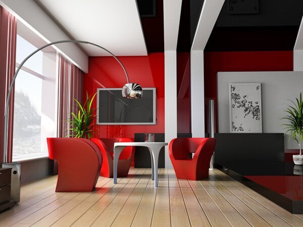
Red is a very attractive color and is associated with strong emotions such as love, passion, strength, power, and anger. Too much red can create aggression and sometimes it can be overpowering. Red can also give you the confidence and enhance your space when used with right complementing colors. So, if you love red and want to use it in your home, there are plenty of shades that you can choose from. It can be used in office buildings, home offices, in the living room and in the bedroom.
Yellow- A Happy Color
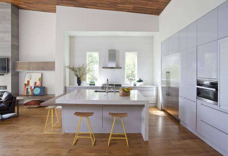
Being the lightest hue of the spectrum, yellow helps in uplifting the spirit, illuminating the space, offering hope, happiness, and fun. It creates a sense of cheerfulness and playfulness, elevating the spirit of the user. Excess use of yellow can cause anxiety and nervousness and hence using the right amount, shade, and pairing it with the right complimenting color is an excellent idea. Yellow works well with greys, blues, greens, and white. In interior design, it is recommended for the kitchen, dining areas, hallways, and bathrooms.
Blue – Loyalty and Integrity
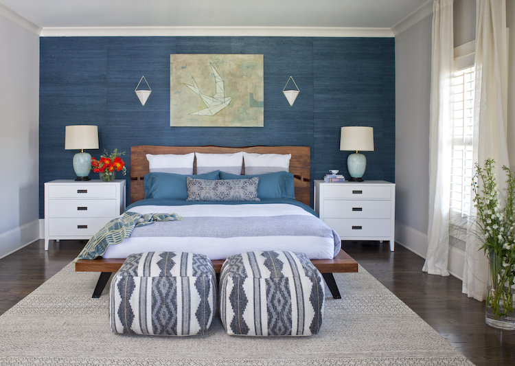
Blue is the most universally favored color of all. It represents trust, serenity, and peace. While inspiring wisdom and higher ideals, it is sincere, reserved, quiet, and creates a sense of space. Blue can also create a feeling of sadness, aloofness, reduce the pulse rate, body temperature, and appetite. Hence it is always advisable to add some bright color to balance the harmony and the energy of the space. A combination of light and dark blue colors compliment the look of the bedroom and dining room.
Green- Balance and Growth
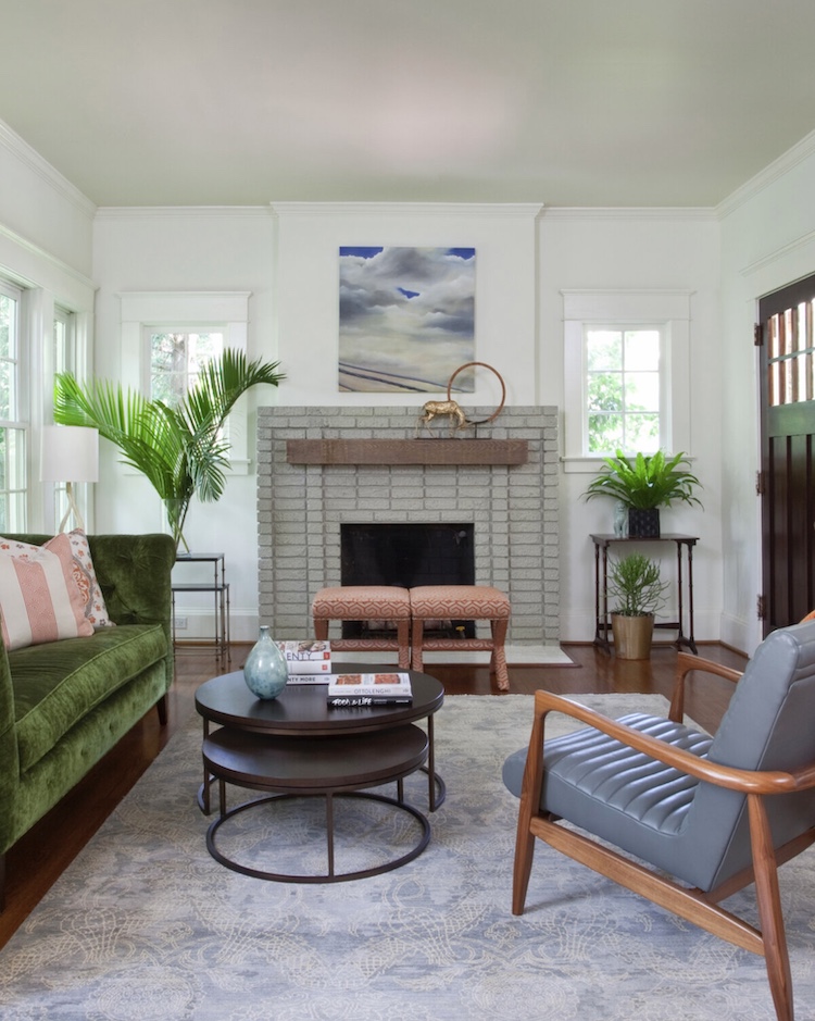
Green symbolizes harmony, healing, and stability. Dark shades of green is associated to money, wealth, and prestige, while lighter greens represent rebirth, growth, and freshness. It is favorable for anything related to health and healing. Too much of anything can have adverse effect and hence the space should always be well-balanced with right shade and contrasts. Green can be used in different shades throughout the house.
Orange- Optimism
Orange is the hue of optimism, self-confidence and encouragement. It radiates warmth and happiness that we get from yellow, combining the physical energy from red. It represents more feminine energy and the energy of creation. It is best used in bedrooms with complimentary tints that tone down the extreme effects of the color. Orange also increases appetite and hence is suitable for indoor and outdoor kitchen areas.
No Comments