15 Jan Pantone Colors of the Year: Balance Design Weighs In
By Allie Andrews and Roshni Parthasarathy

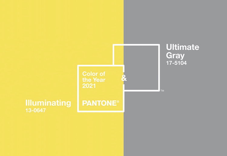
Each December, the team at Balance Design is eager to learn what the pantone color will be for the following year. We enjoy pulling color palettes together and finding inspiring installation pictures that incorporate the color(s). This year, Pantone chose 2 colors (this has only been done once before, in 2016) which have proven to be quite controversial. The colors chosen, Illuminating and Ultimate Gray, have split our team with yay’s and nay’s. In honor of Pantone surprising us with two new colors, we thought we’d surprise our readers with two new voices from Balance Design. We’ve been very fortunate to have Allie Andrews (design assistant) and Roshni Parthasarathy (design intern) join our team. Read on to hear these two new team members give their thoughts on this challenging color pairing.
Roshni: Yes!
2020! What a year it has been! There is no limit to the trials and tribulations that we all have faced. But it is time to look forward to a brand-new year of resilience, hope and positivity. The combination of the neutral Ultimate Gray and the vibrant yellow Illuminating, mirror these emotions perfectly. It is a combination that projects two highly individualistic colors coming together to express the message of strength and hopefulness. With the yellow adding focus and chirpiness to a space, the gray helps in taking pause for some contemplation and self-reflection. Though both the colors and their combination might be something that we all have used and seen, we all could do with a bit of a fresh perspective this year! Hoping this optimism makes way into our lives and spaces.
Allie: No!
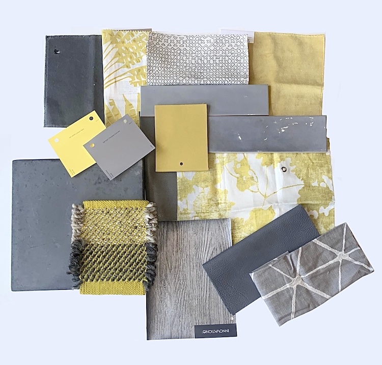
From first glance, the 2021 Pantone colors genuinely evoked a feeling of disbelief. I felt like I had seen this color combination reach the pinnacle of modern design… years ago. The yellow’s lack of warmth, paired with the lightness of grey makes the combination feel slightly sterile. These negative feelings were not as prominent until I was given the task of creating a color palette. I found myself with a collection of dated samples that just made the frustration build. Eventually, I took to the internet for inspiration. I felt almost every design I came across, did not reach a mark of sophistication or relevance. This is not to say these shades of grey and yellow can not be beautiful in their own right. I simply believe that these two shades together do not lend themselves well enough to design, in 2021, to be inspiration for the year.
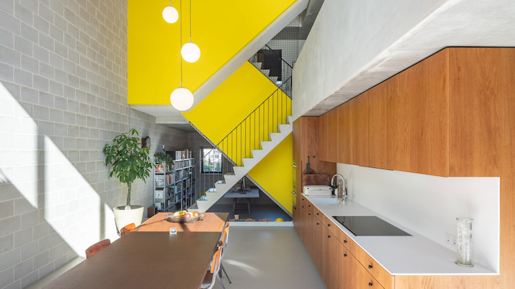
Despite the polarizing effect this year’s choice has evoked, we are all eager to see the ways designers and consumers incorporate these colors into their spaces. We’d love to hear the thoughts of our readers, and see any creative solutions implementing Ultimate Gray and Illuminating.
No Comments