
29 Jan Color Theory 101
Here at Balance Design, we adore color! Time and time again our clients and vendors comment “we were drawn to you because we noticed you’re not afraid to use color” and “we always know it’s a design by you when there is lots of color!”. Of course there are certain settings where a soft neutral palette is the undisputed perfect choice. However, using color can change the entire mood and feeling of a space. That being said, we decided to give a brief overview of color for all of our readers.
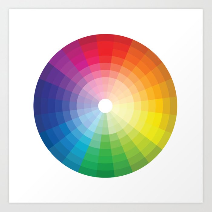
Hue
A hue refers to a specific color without any other attributes. It is a pure color. There are 3 primary hues- red, yellow, blue. These hues cannot be made, however they can make all other hues when mixed together. After mixing two primary hues, you create the 3 secondary hues- orange, green, violet. In addition to the secondary hues, there are Intermediate hues- these are a mix of primary hues in different proportions. Because of the different mixed hues and different proportions, the number of hues you can create are infinite.
You will see many of these hues represented on the color wheel. The color wheel can be a phenomenal tool to use when you are assessing color palettes and trying to coordinate multiple colors together. Below are a few terms that will help you analyze the color wheel and select the colors perfect for your space.
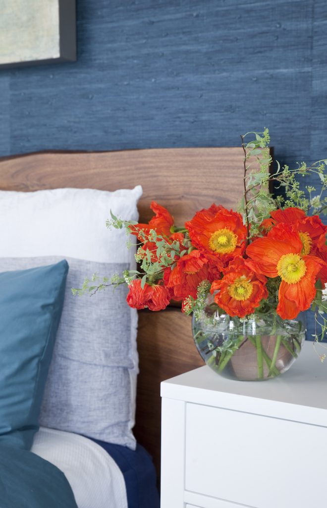
Complementary Colors- two colors on opposite sides of the color wheel ( such as blue and orange). These color combos create palettes that are vibrant and bold without feeling overwhelming, and have warm and cool combos that complement each other. You can utilize these colors in permanent furnishings or fun accents like flowers or plants.
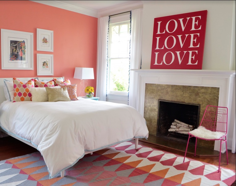
Analogous Colors- Colors that are adjacent on the color wheel (such as red and orange). These color combos create palettes that are more restful and united. Even with bolder hues, analogous color palettes can be harmonious and serene.
Monochromatic Colors- Shades and tints of a single hue.
These color combos can create palettes that are dramatic, intense, and interesting and/or soft and relaxing depending on the hues selected. However, they can be dull and uninteresting if the tones and values do not have enough variation or accents (read too matchy-matchy).
Within all of these hues, there are two main attributes of color– VALUE and INTENSITY
Value is the lightness or darkness of a hue. There are also two types of Values- Shades and Tints.
A Tint is a mixture of any hue with white. Hues that are lighter than primary colors are considered tints. A Shade is a mixture of any hue with black. Hues that are darker than primary colors are considered shades. Often times you will hear these words used interchangeably. However, they are not the same! Now you can use these terms with confidence and know exactly what some experts may be referencing.
Intensity is the purity of a hue. This refers to how intense the color is or the grayness of a hue. To tone down a hue you add its complement. Mixing complementary colors together creates a neutral color (brown). Gray is the result of mixing two colors devoid of saturation. When a hue is more grayed, the saturation has been reduced. For example- If a red color is too intense, adding a small amount of green will neutralize the hue and the red will become somewhat subdued.
Of course, choosing the right colors may take some practice. But, with inspiration and a little education, the perfect palette is out there! We want people to embrace color in the ways that are right for them. Utilizing this vocabulary will help guide color novices to create sophisticated color palettes that set the (appropriate) mood!
Let us know the ways you love to use color in your spaces! We can’t wait to see!
No Comments