My Love-Hate Relationship with Design Trends
1/09/25
Hey! I'm Stephanie from Atlanta, GA. I've been an interior designer at Balance Design for nearly 25 years and I'm passionate about curating a life of beauty, curiosity, and adventure! Come along as we explore the small details that make everyday life more beautiful — all through the lens of someone who has spent a lifetime paying attention to how spaces shape the way we live.
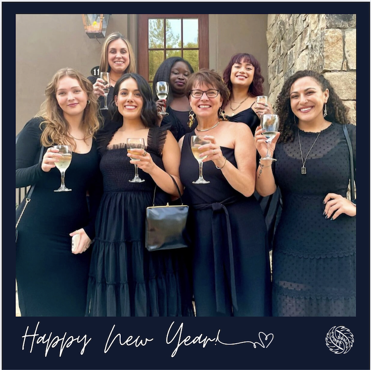
Happy New Year!
I hope you had a wonderful holiday season. I felt so blessed to have some time off from Christmas to New Year’s – it was truly rejuvenating!

Every year at this time, my social media feeds and design publications are filled with predictions for the upcoming year’s trends. From the color of the year to the latest decorating styles, I always find myself reading these forecasts with the same enthusiasm as my horoscope!
While I enjoy reading these trends, I find the “What’s In vs. What’s Out” articles particularly frustrating. It seems unfair to suggest that someone’s choices are “wrong” simply because they’re no longer trending. Home design involves a significant investment of time, money, and resources. To dismiss that effort based on arbitrary trends feels disrespectful. We need to celebrate the commitment and follow-through involved in any design and renovation project. The most important thing is that the final result works for us, our families, and our homes.
That being said, I thought that I would share some of the trends that I have been enjoying. I particularly like color trends because, to me, paint is the biggest bang for the buck. I will often suggest a color because I like it, yet I know that it is not too difficult to change it out in a few years, if so desired.
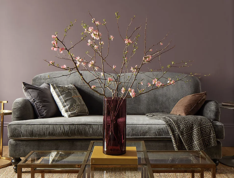
Benjamin Moore’s Cinnamon Slate
Benjamin Moore’s color of the year is Cinamon Slate 2113-40. Personally, I am very happy to see a new color like this. I recently used a similar color in a client’s butler pantry and it looked so good! Adding surprise and warmth is just what this little space needed. I can also see it in a powder bath, on all walls, trim, and even the ceiling. Speaking of this whole room paint concept, I think that the color-drenching trend is statement-making and quite striking. I like to use a semi-gloss or high gloss on all of the wood, cabinetry, and sometimes even the ceiling, then contrast the walls with a very flat paint.

Sherwin Williams Color Capsules
Sherwin Williams did not commit this year to a color of the year. They made a color capsule. I thought that this was an interesting choice, and I wondered if they were simply tired of hearing divergent opinions of their choice? Every year, at Balance Design, we usually have a conversation about the color of year choices, so perhaps Sherwin Williams wanted to get out of the controversy? Who knows. I do like the idea of a capsule of colors that work well together. That does not seem to be what this is. It seems that this is simply trying to please everyone. One thing that I did enjoy was the video styling it seemed quite fresh.
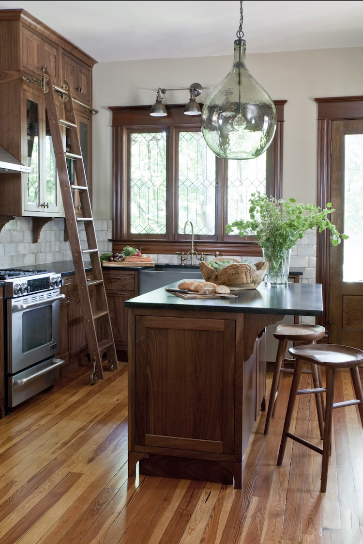
A timeless yet on-trend kitchen that we designed a few years ago.
Kitchen trends that I believe will continue to grow are cabinets in highly saturated and surprising colors and many shades of wood. The wood cabinetry in the kitchen continues to feature a highly textured look with hand-crafted tiles and interesting lighting. I think this more natural look is very easy to live with and timeless, although the colorful kitchen will usually get the most notice in magazines and on social media. We are now seeing the addition of scullery kitchens, which is a fascinating way to hide your dirty dishes! In other words, these secondary smaller kitchens feature extra appliances, so that the big fancy kitchen looks clean and ready. Is this really a good idea? Seems rather complicated and extra to me.
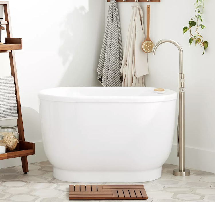
Japanese Soaking Tub by Signature Hardware
In the bath, we have seen many beautiful Japanese influences like the soaking tub and my favorite-the Toto toilet. Quality, beauty, and function is what impresses me most about Japanese design. I think that this is more than a trend-it is a way of life. Couple this with a Danish infrared sauna in your bath and you may never want to leave!
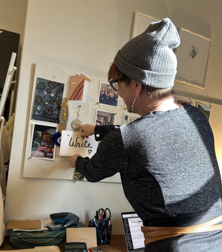
My Word of the Year “Write”
I hope that the digital detox trend will continue, because I am tired of being flooded with imagery, trends, and pushed consumption. I am working on minimizing my scrolling and choosing to read and write more. I am ready for 2025 to be a time of less TV and social media and more time for conscious living on things that I want to grow in.
Speaking of growing, my word for 2025 is Write! I intend to share with you on Design Pulp weekly (instead of bi-weekly) and I am very excited about that. I have some fascinating interviews, insights, and travels planned and I would love to take you with me! If you have an idea for a topic that you would like me to explore or research, please email me at stephanie@balancedesignatlanta.com. I would also just love to hear what you are thinking about in 2025, from trends to your word of the year or those little design questions that have been on your mind. Let’s share.
Until next week,
Stephanie
