15 Apr Decatur Design Challenge
Each week, we share ideas, concepts, trends and our own passions on interior design. As designers, we have also been challenged by the many logistics issues that have been presented, especially through the pandemic. However, with patience, substitution and lots of adjusting, some projects are worth the effort. We wanted to share one of those projects. We interviewed lead designer, Melody Richardson to learn more.
Globally Curated Media Room
BD: How would you describe the clients style?
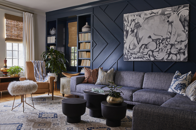
MR: We knew straight away that this client had a sophisticated sense of style. She had spent ample time curating her global treasures and just needed some help to update her space to accommodate their changing needs. She was not afraid of color, but valued a timeless design that she and her husband could enjoy for years to come.
BD: What were your objectives in the media room?
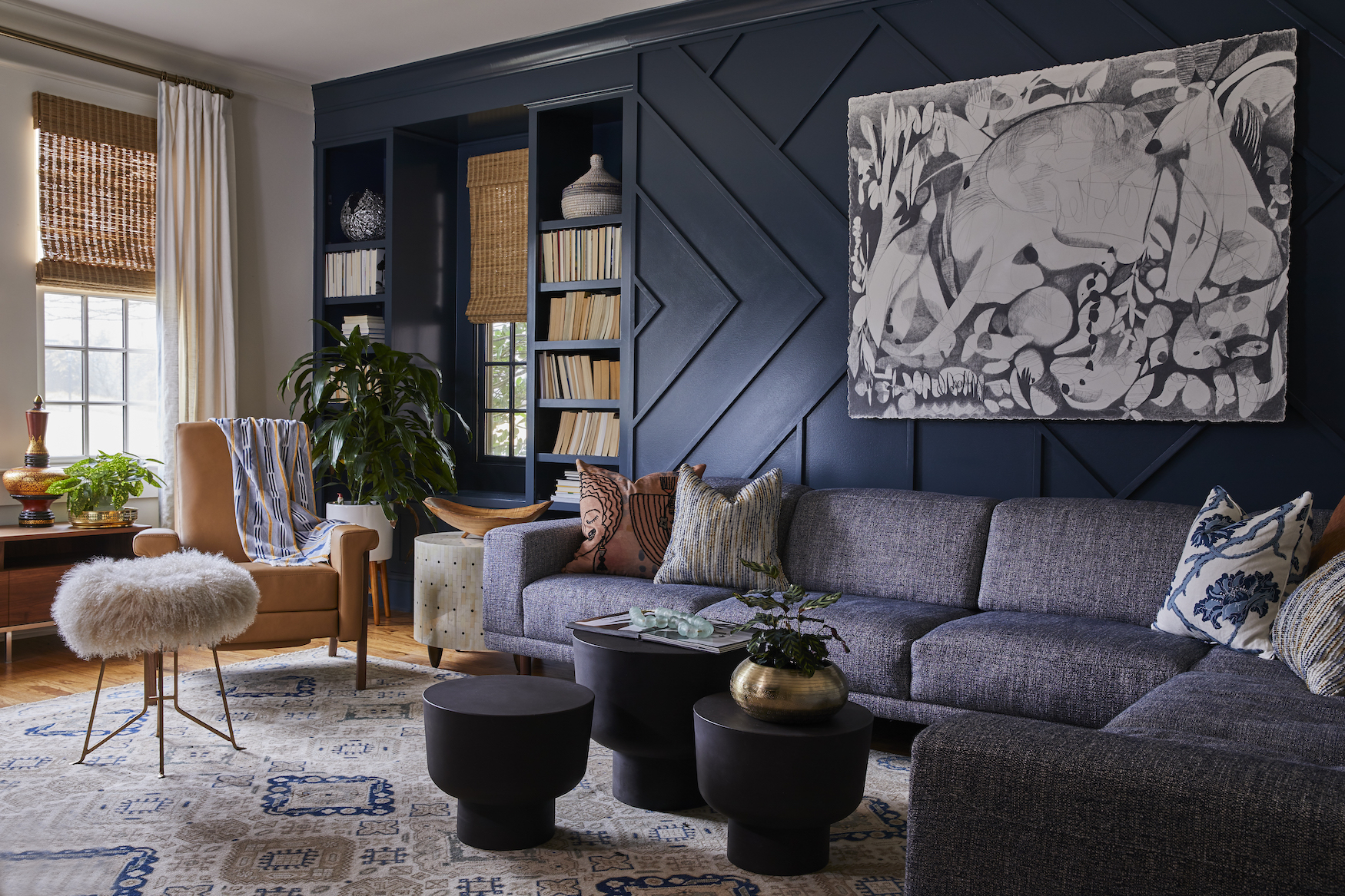
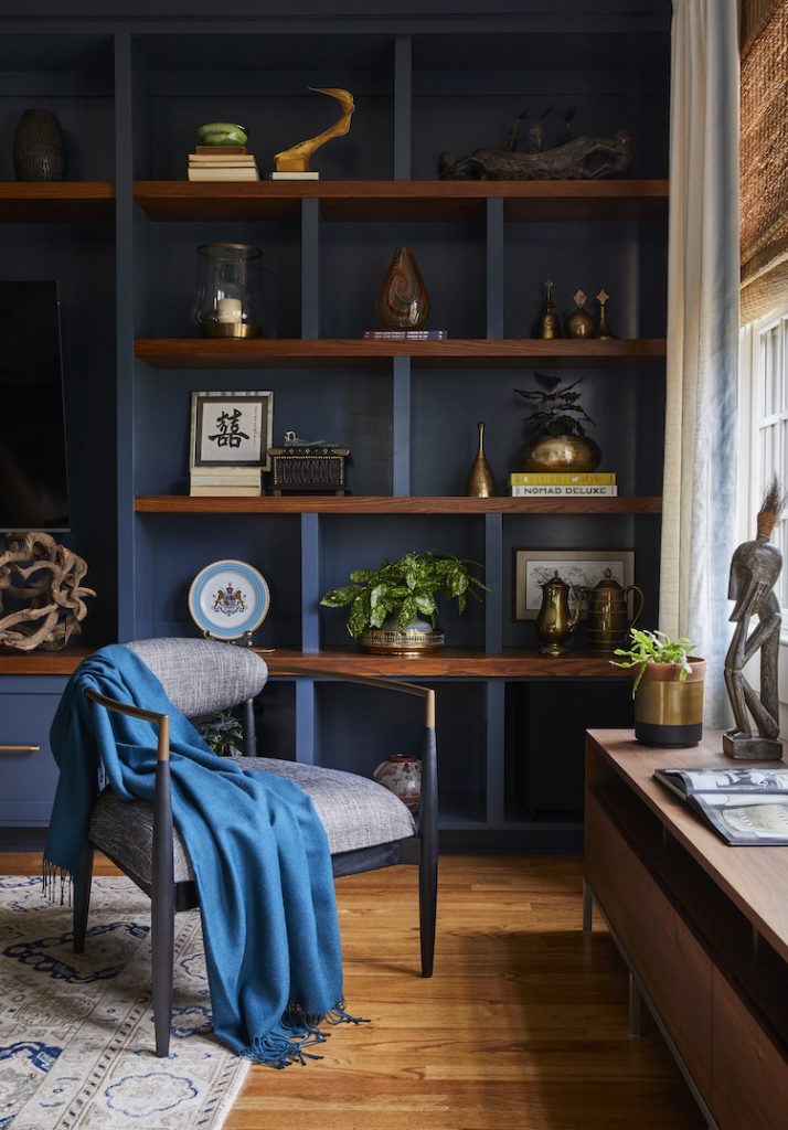
MR: The objective in the media room was to create a space that she and her husband could use together. He often liked to watch sports on the sofa, and she wanted a comfortable place where she could read or work while sharing the space. They also enjoyed watching movies together, especially when her college age children are home. It was important to have very comfortable seating for all, as well as enough space to display family photos, collected pieces, and their treasured books. The biggest trick to this space was finding the right arrangement of the furniture pieces as the room was nowhere near symmetrical.
BD: What were some of your inspiration ideas?
MR: When we first discussed our inspiration for the room, our client mentioned she loved the idea of a well curated NYC loft. She wanted a wall to wall built in with sleek and sophisticated lines, but needed something that would blend well with the style of the rest of the house as well. She also had a large piece of black and white art that she wanted to incorporate. Due to the size of the room, we felt that a dramatic, masculine color palette with layered textures would feel best. One of our favorite ways to add a fresh yet timeless element to a space is to incorporate an unexpected vintage rug- and we succeeded! Ultimately the dark blue that went on the accent wall and the built in created the perfect bold base for the incredible global pieces we were able to incorporate.
What is your favorite part of the room?
MR: This is a very difficult question to answer. I love so many elements of this space- the accent wall, the built in, the bunching tables! But, if I had to choose, I’d say my favorite part of the room is actually the rug. We found this one of a kind, antique turkish rug that made my heart sing. The second I saw it, I knew it was the one. It is so rare to find that quality, size, and color palette all in one! It truly is a stunning piece.
Whimsical Powder Room
BD: How would you describe this powder room in 3 words?
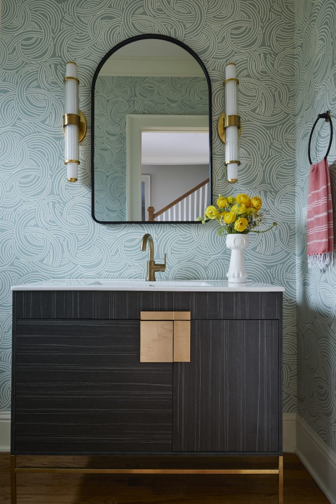
MR: Fun, bright, and impactful. When we began the concept of redesigning this powder bath off the entry of the home, we knew we wanted it to be a space that would have guests feeling surprised and rejuvenated at the same time. We found a sleek vanity and paired it with a bold, yet soothing wallpaper which allowed the rest to come together beautifully.
BD: Any issues making this bath come together?
MR: Yes! As many of our readers and clients know, there is usually at least one thing that trips us up in a project. In this case it was the vanity. When we first saw it, we knew it was a fantastic option-it was so pretty and unique! Unfortunately, we had no idea how long it would take to actually get this piece in. Due to the delays of the pandemic, it ultimately took almost 10 months from the time we placed the order to the time we actually installed it. At one point we actually thought the vendor was dodging us and hadn’t in fact placed the order at all. However, after many months and a TON of patience from our client, the vanity arrived and we knew it was worth the wait. It perfectly completed this lovely little powder room, and we couldn’t be happier with the outcome.
Guest Bedroom Getaway
BD: How did you begin this design?
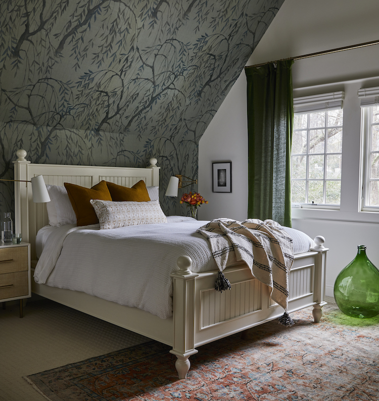
MR: We began this design with thoughts of creating a little retreat for our clients parents, who visit often. We wanted to design a space that felt fresh and inviting, but also a like a special little getaway. Right off the bat, we knew we would be using the existing bed and dresser. The challenge was to create a space that incorporated the older pieces but still felt brand new.
BD: What made you select the wallpaper?
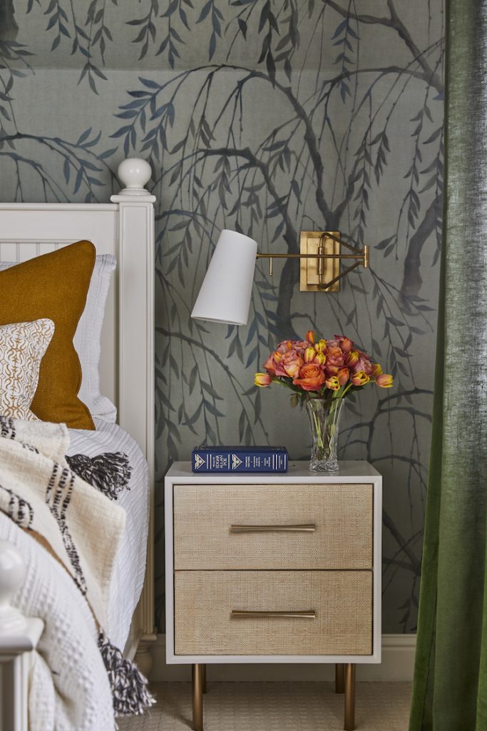
MR: We knew straight away that these 16′ vaulted ceilings deserved some sort of wall treatment. We pondered a few patterns and colors, but when we saw the willow trees we fell in love. The thought of the soft willow branches enveloping this top floor suite evoked feelings of warm, southern coastal evenings that soothe the soul.
BD: Anything else that we should know about designing in today’s environment?
MR: I think the biggest takeaway from this project and today’s design environment is that patience is key. Whether you are facing continuous delays for furnishings, indecision on specific pieces, or even trial and error solutions for unexpected problems, having grace and patience will ultimately lead to the best outcome. Creating the perfect space for you is always worth the wait.
There are many elements that go into a good design. From the client relationships and inspiration, to the creative process and implementation, a full design project is a journey that we and the clients take together. We hope to share more insight into our projects as well as the love and passion that goes into them.


No Comments